collapse

Resources

Stud of St. John's Game

No Stud when we lose.
2024-25 Season SoG Tally
Jones, K.7
Mitchell5
Joplin4
Ross2

'23-24 '22-23
'21-22 * '20-21 * '19-20
'18-19 * '17-18 * '16-17
'15-16 * '14-15 * '13-14
'12-13 * '11-12 * '10-11

Big East Standings

Recent Posts

WWE @ MSG by tower912
[Today at 06:45:48 AM]


Let's talk about the transfer portal... by Uncle Rico
[Today at 06:45:18 AM]


Ref Show by Newsdreams
[Today at 05:46:37 AM]


Ben Gold by tower912
[Today at 05:25:46 AM]


St. John's by willie warrior
[Today at 03:48:22 AM]


Modest Suggestions For In-game Adjustments by burger
[Today at 01:21:19 AM]


Observations by TAMU, Knower of Ball
[Today at 01:09:55 AM]

Please Register - It's FREE!

The absolute only thing required for this FREE registration is a valid e-mail address. We keep all your information confidential and will NEVER give or sell it to anyone else.
Login to get rid of this box (and ads) , or signup NOW!

Next up:  @ Creighton

Marquette
64
Marquette @
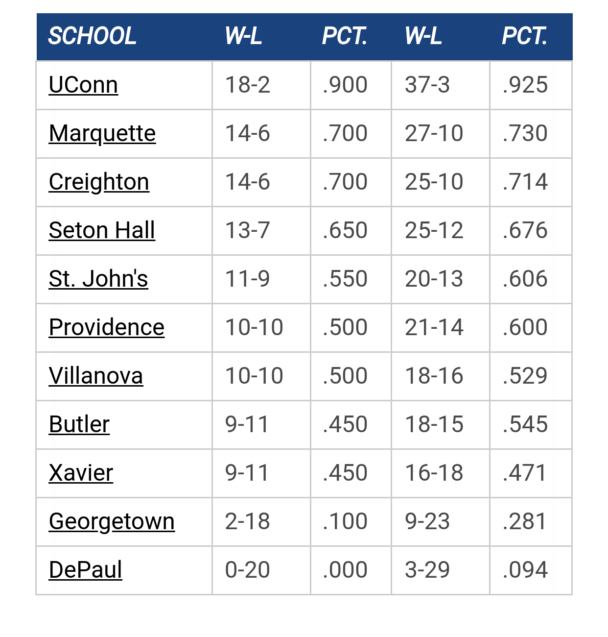
Creighton
Date/Time: Feb 8, 2025 1:00pm
TV: Fox
Schedule for 2024-25
St. John's
70

🏀

#125
Quote from: Scoop Snoop on January 26, 2022, 09:39:37 AM
Thanks, (and yes) that's the word I needed.

That's a hard not going to happen. You don't often rebrand a monogram.

When the Big East expanded there was a push for simple, bold monogram for all the schools. The only school that didn't clean up their primary monogram was DePaul. Instead they stuck with their busy Blue Demon shield.


It's terrific branding. More and/or is not better n this situation.

StillAWarrior

Quote from: Retire0 on January 26, 2022, 10:19:50 AM
That's a hard not going to happen. You don't often rebrand a monogram.

When the Big East expanded there was a push for simple, bold monogram for all the schools. The only school that didn't clean up their primary monogram was DePaul. Instead they stuck with their busy Blue Demon shield.

It's terrific branding. More and/or is not better n this situation.

I'm actually a fan of lettermarks that are instantly recognizable, so I like the MU mark (and prefer it without the "Marquette" banner).
Never wrestle with a pig.  You both get dirty, and the pig likes it.

Spotcheck Billy

Quote from: Fluffy Blue Monster on January 26, 2022, 09:51:58 AM

I doubt Marquette has used anything in house for athletic branding since the name change.

Wait, what were they called before Marquette?

🏀

#128
Quote from: StillAWarrior on January 26, 2022, 10:26:59 AM
I'm actually a fan of lettermarks that are instantly recognizable, so I like the MU mark (and prefer it without the "Marquette" banner).

Agree. This is the best. I made a 3D wood version of it for my basement 7-8 years ago.


I think Marquette prefers to include the name since going with MU is still a struggle with Mizzou.

GB Warrior

Quote from: Retire0 on January 26, 2022, 10:30:23 AM
Agree. This is the best. I made a 3D wood version of it for my basement 7-8 years ago.


I think Marquette prefers to include the name since going with MU is still a struggle with Mizzou.

This is the best one, and I also like it without the wordmark.

I think what is strange about the court is that it doesn't tie in to our current uniforms (or any of the most recent ones. Font is different and (more irritatingly to me) the blues used are different. I'd much rather use Navy as the primary base than the royal blue.

TallTitan34

I may be completely misremembering but I thought when the monogram logos debuted during the Gold name change, the one with the "Marquette" banner in front was to identify who this new logo belonged to with the long term goal being to go with the bannerless monogram once the logo was widely recognized.

I like the monogram.  Wouldn't change it.

The Sultan

Quote from: TallTitan34 on January 26, 2022, 12:55:28 PM
I may be completely misremembering but I thought when the monogram logos debuted during the Gold name change, the one with the "Marquette" banner in front was to identify who this new logo belonged to with the long term goal being to go with the bannerless monogram once the logo was widely recognized.

I like the monogram.  Wouldn't change it.


The one with "Marquette" is the primary athletics monogram.  The one without is secondary.

https://www.marquette.edu/omc/documents/MU%20Logo%20Standards.pdf
"I am one of those who think the best friend of a nation is he who most faithfully rebukes her for her sins—and he her worst enemy, who, under the specious and popular garb of patriotism, seeks to excuse, palliate, and defend them" - Frederick Douglass

TallTitan34

Quote from: Fluffy Blue Monster on January 26, 2022, 01:03:14 PM

The one with "Marquette" is the primary athletics monogram.  The one without is secondary.

https://www.marquette.edu/omc/documents/MU%20Logo%20Standards.pdf

I'm aware, but I thought the end goal was for the bannerless logo to be the primary down the road.

(Cheap plug:  I've recently added old Marquette logos to www.muoverload.com > Miscellaneous > Logos)

I enjoy that the monogram is similar to an MU used in the 60s.  See attached photo.

Billy Hoyle

Quote from: TallTitan34 on January 26, 2022, 12:55:28 PM
I may be completely misremembering but I thought when the monogram logos debuted during the Gold name change, the one with the "Marquette" banner in front was to identify who this new logo belonged to with the long term goal being to go with the bannerless monogram once the logo was widely recognized.

I like the monogram.  Wouldn't change it.

You are remembering correctly.

Having the school name in the logo is very mid-majorish. The MU in itself is excellent.

Quote from: Retire0 on January 26, 2022, 10:19:50 AM
That's a hard not going to happen. You don't often rebrand a monogram.

When the Big East expanded there was a push for simple, bold monogram for all the schools. The only school that didn't clean up their primary monogram was DePaul. Instead they stuck with their busy Blue Demon shield.


It's terrific branding. More and/or is not better n this situation.

DePaul has doubled down on their logo, which is the worst in the conference by far. It's all over their athletic facilities now.
"Kevin thinks 'mother' is half a word." - Mike Deane

Galway Eagle

Quote from: Billy Hoyle on January 26, 2022, 01:29:50 PM
You are remembering correctly.

Having the school name in the logo is very mid-majorish. The MU in itself is excellent.

DePaul has doubled down on their logo, which is the worst in the conference by far. It's all over their athletic facilities now.

They doubled down ten years ago at this point it's tripled down or more. I had a depaul hat with roughly that logo in 2001
He's the one
Who likes all our pretty songs
And he likes to sing along
And he likes to shoot his gun
But he knows not what it means

Jay Bee

If they put a chicken on the court, I will not attend games.
Save TikTok. Those creators are like family. #dafuq

TallTitan34

Speaking of DePaul needing a long overdue rebrand, is Xavier ever going to drop the crappy X on the side of their shorts? 

Galway Eagle

Quote from: TallTitan34 on January 26, 2022, 01:45:21 PM
Speaking of DePaul needing a long overdue rebrand, is Xavier ever going to drop the crappy X on the side of their shorts?

If you talk to X fans they think it's the coolest most unique thing ever
He's the one
Who likes all our pretty songs
And he likes to sing along
And he likes to shoot his gun
But he knows not what it means

Billy Hoyle

Quote from: Galway Eagle on January 26, 2022, 01:33:22 PM
They doubled down ten years ago at this point it's tripled down or more. I had a depaul hat with roughly that logo in 2001

replacing Billy Blue Demon was a mistake. They released a limited number of Billy t's last year (I think I was told 400), one had to donate to buy it. They were gone within an hour.  I thought the new AD would look to make a change, instead, he's gone even more all in.

Quote from: TallTitan34 on January 26, 2022, 01:45:21 PM
Speaking of DePaul needing a long overdue rebrand, is Xavier ever going to drop the crappy X on the side of their shorts? 

I like it. It's unique to them as the only "X" school in D1.
"Kevin thinks 'mother' is half a word." - Mike Deane

romey

Quote from: TallTitan34 on January 26, 2022, 01:45:21 PM
Speaking of DePaul needing a long overdue rebrand, is Xavier ever going to drop the crappy X on the side of their shorts?

Funny you mention that.   I was at the last game and actually finally realized that "X" on the shorts is crossed swords.  Am I last one to notice that?

TallTitan34

Quote from: Galway Eagle on January 26, 2022, 01:49:16 PM
If you talk to X fans they think it's the coolest most unique thing ever

I guess it is unique in that it doesn't match the rest of their jersey.


🏀

Quote from: Billy Hoyle on January 26, 2022, 01:51:47 PM
replacing Billy Blue Demon was a mistake. They released a limited number of Billy t's last year (I think I was told 400), one had to donate to buy it. They were gone within an hour.  I thought the new AD would look to make a change, instead, he's gone even more all in.

I like it. It's unique to them as the only "X" school in D1.

Billy Blue Demon could get a upgrade similar to the SH Pirate and look amazing.

Mu8891

I agree that the " clean " MU, without the Marquette written in front is FAR better ...

And ... I never noticed that the ( ugly )
X was swords

GoldenEagles03

Quote from: Mu8891 on January 26, 2022, 02:25:50 PM
I agree that the " clean " MU, without the Marquette written in front is FAR better ...

And ... I never noticed that the ( ugly )
X was swords

I love this logo and wish they'd go back to it.
VIOLENCE!

GB Warrior

Quote from: Billy Hoyle on January 26, 2022, 01:29:50 PM
You are remembering correctly.

DePaul has doubled down on their logo, which is the worst in the conference by far. It's all over their athletic facilities now.

Providence is not far behind. Their mascot is the only mascot that Marquette fans have any grounds to critique.

Galway Eagle

Quote from: GoldenEagles03 on January 26, 2022, 02:33:27 PM
I love this logo and wish they'd go back to it.

Me too. If there was going to be a Golden Eagle logo a modern version of that's fine by me.

Quote from: GB Warrior on January 26, 2022, 02:48:35 PM
Providence is not far behind. Their mascot is the only mascot that Marquette fans have any grounds to critique.

How about St Louis? That thing is terrifying.
He's the one
Who likes all our pretty songs
And he likes to sing along
And he likes to shoot his gun
But he knows not what it means

Dr. Blackheart

Quote from: romey on January 26, 2022, 01:52:47 PM
Funny you mention that.   I was at the last game and actually finally realized that "X" on the shorts is crossed swords.  Am I last one to notice that?

My wife mentioned it too and thought they just duct taped it on their shorts.

#UnleashSean

Quote from: GoldenEagles03 on January 26, 2022, 02:33:27 PM
I love this logo and wish they'd go back to it.

This is the correct logo, and a mid court of that like Kansas would be nice.

Billy Hoyle

"Kevin thinks 'mother' is half a word." - Mike Deane


Previous topic - Next topic